

ING Bank
Global Transaction Redesign
Product Type
Digital banking
41,000,000 Users
40 Countries
My Role
UX Design
User Research
Time
2 Major Iterations
3 Weeks
With
2 Product Managers
2 Developers
1 Data Analyst

Summary
ING Group is the seventh-largest multinational bank in Europe and the largest bank in the Netherlands, providing retail and wholesale banking services in over 100 countries worldwide. I collaborated closely with cross-functional teams and independently completed the redesign of the feature.
By analyzing funnel metrics across different steps, reviewing insights from The Voice, the internal customer feedback platform, and conducting user interviews, I identified the core user pain points. I then restructured the user journey to make it more intuitive.
Following the launch of the new Global Transaction experience, the redesign delivered strong results. It achieved a 32.6% reduction in drop-off rate and a 22.1% decrease in overall error rate, while overall CSAT increased by 25%.
Problem Definition

Constraints

Kaiyuan Li(Kai)12:01 PM
Hey team! We’ve consolidated feedback from all teams, and the final design is now complete and approved in design review. It’s ready for dev! Please take a look at the Figma link below when you have a moment. Really glad we were able to align on the direction. Thanks so much for all the support! 🙌
The new design system was not live, so I had to work within the legacy system with limited visual flexibility.
The project required managing trade-offs across multiple departments while balancing design quality and development efficiency.
Design Highlights
Users can clearly see fee changes at different amounts through an intuitive transaction calculator with icons; they can also enter the desired received amount to reverse-calculate the send amount.
Transaction Calculator
Drag the slider to compare
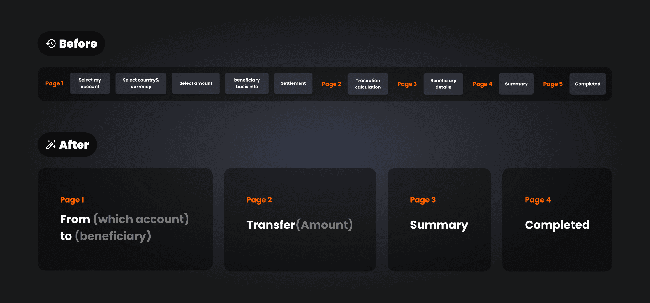
The previous Global Transaction page was expanded from the original SEPA(Single Euro Payments Area) transfer design to accommodate evolving business needs. Over time, as business scope and compliance requirements changed, the user journey became increasingly complex and bloated.
To reconstruct the information architecture, I worked closely with PMs from relevant business teams through multiple rounds of discussion. Without compromising key business metrics, I drove a redesigned user journey grounded in users’ mental models.
Information Architecture
I created a cleaner and more logical hierarchy and added convenient small features (for example, allowing contacts to be marked as favorites), which lowered information density and improved efficiency.
Reduce Cognitive Load
I organized cluttered input fields and options into dialogs and dropdown menus, added step indicators, and optimized the UX writing.
Clear Steps
The user journey for global transactions is lengthy and easily disrupted by factors such as forgetting an address or IBAN, or comparing fees. To streamline the experience, I introduced three entirely new features.
A Frustration-free Journey


